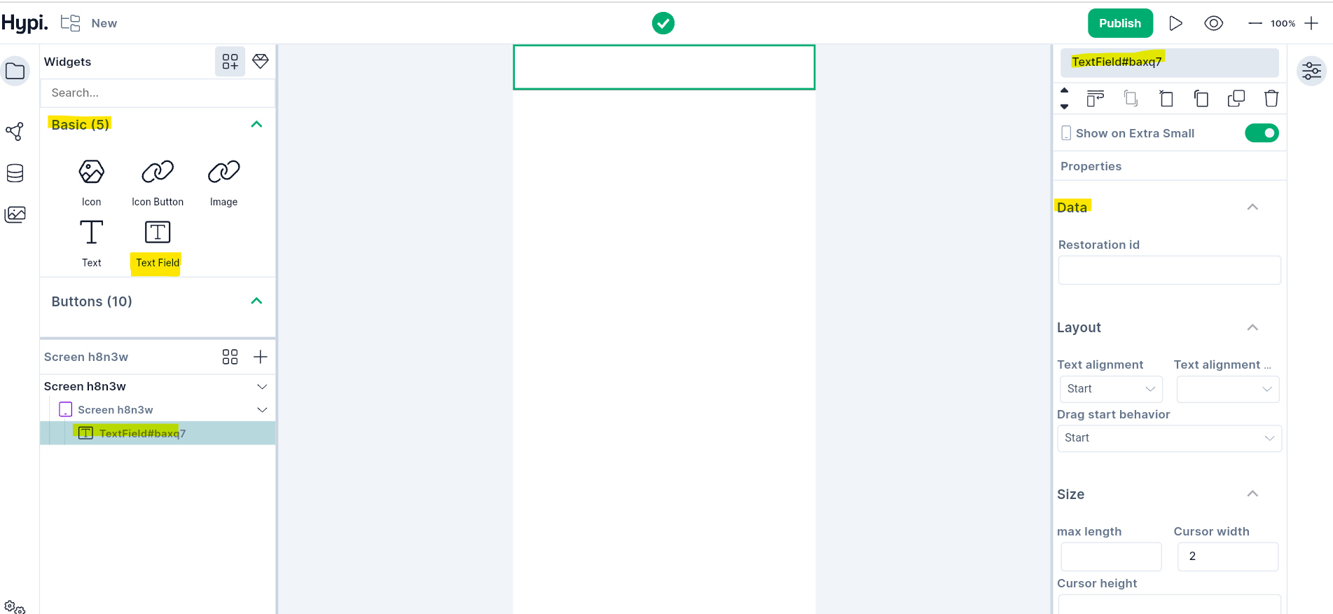
Text Field
Overview
Text Field is a basic widget that accepts user inputs. Enter the text in this widget using hardware or an onscreen keyboard.
Use Cases
- TextField accepts and processes user inputs.
- Works as an edit box where the user can enter values for a field and edit the entered text.
- Input fields like username and password are the commonly used TextFields.
- A form may have many user input TextFields.
Properties
Data
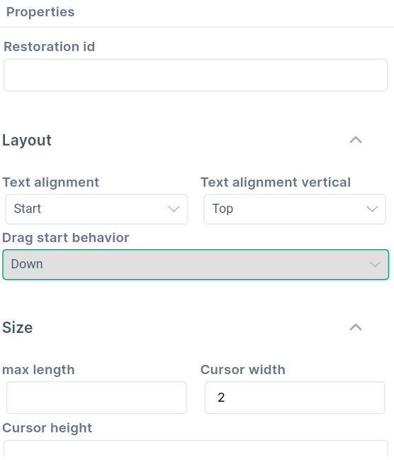
Restoration idsaves and restores the current state of TextField. Restoration data is stored in a restoration bucket under a given restoration id as a key. All information that the application needs to restore is stored in the bucket. Restoration id is a unique String within a given bucket. TextField retrieves the data by using the same Restoration id that is originally used to store the data.
Layout
- Text Alignment shows how the text should be aligned horizontally. Probable values are Left, Right, Centre, Justify, Start, or End.
- Choose how to align the Text vertically; starting from the Bottom, Top, or Centre.
- Choose the Drag Start Behaviour value; Down or Start.
Size
Max Lengthindicates the maximum number of characters allowed in the Text Field.Cursor Widthdecides the thickness of the cursorCursor Heightdecides the height of the cursor
Typography
- Text styling properties like Font, Size, Weight, etc are described here.
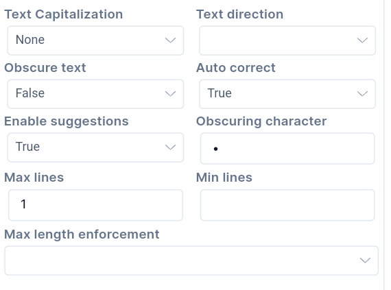
Text Capitalizationconfigures how the uppercase or lowercase keyboard gets selected. TheNonesetting stops Capitalization.Charactermakes each character capital.Wordsmake the first character of each word capital.Sentencesmake the first character of each sentence capital.Text Directioncan beLeft to RightorRight to Left.Obscure Textdecides whether to hide the text being edited. Passwords are the common fields for obscure text.Auto Correctdecides whether to enable auto-correction of the text. The default value istrue- Setting
Enable Suggestionto true, shows input suggestions as the user types. - If
Obscure Textis true,Obscuring Characteris used for obscuring text. It must be only a single character. The default character is U+2022 BULLET (•). Max Linesindicates the maximum number of lines that can be shown at a time.Min linesindicates the minimum number of lines to occupy when content has fewer lines.- Check the
Max Length Enforcemetvalues here.
Effects
Decoration
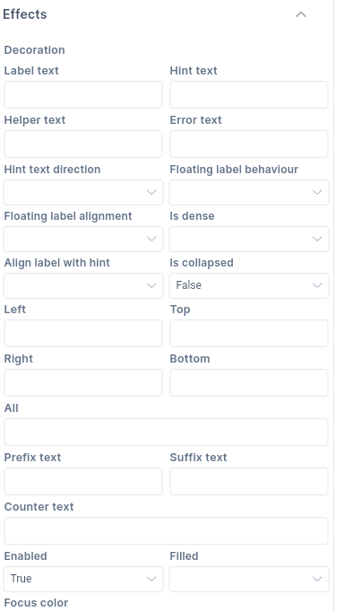
Label Textis an optional text that describes the TextField. When TextField is empty and unfocused, the label gets displayed on top of the user input area. When a user starts entering text and Text Field gets focused, the label moves above, either vertically adjacent or to the center of the input area. (Depending upon Floating Lable Alignment)Hint Textsuggests what sort of input gets accepted in the TextField area. When the Text Field gets focus or the Lable text is empty, the Hint Text gets displayed on top of the user input area. (Replacing Label Text)Helper Textsets the context about the TextField's input value such as how the input text will be used, what are the appropriate input characters, etc. The helper text is shown below the input text area (below the border). If the error text value is also given, the helper text is not displayed.Error textvalue gets displayed if an invalid value is entered in the input Text Field. It appears below the text field input area and the border. If non-null, the border color animates to red. If the error text is present, helper text is not shown.- The direction of the Hint Text is shown using
Hint Text Direction. It defaults from Right to Left. But it can be set from Left to Right as well. - Label Text position can be adjusted using the
Floating Label Behaviourdrop down menu. Label text disappears with focus if theNever Floatoption is set. The label will always float at the top of the field above the content if theAlways Floatoption is set. WhenFloat when the field is focusedoption is set, the label will float to the top only when the field is focused or has some text content, otherwise it will appear in the text field in place of the content. - Floating label can be centrally aligned at the top of the field. Or the start position aligns the label to the rightmost or leftmost position, vertically adjacent to the label.
- TextField uses less vertical space if
isDenseproperty is true. It becomes part of Dense form. isCollapsedproperty sets whether the TextField widget is of the same size as the input area. If set to true, it surrounds Hint Text and Input area with a border. But it does not add padding around them and it can not have Label Text and Error Tex.Leftvalue indicates offset from the left borderTopvalue indicates offset from the top borderRightvalue indicates offset from the right borderBottomvalue indicates offset from the bottom borderAllvalue indicates offsets from all the sidesPrefix Textis an optional text prefix to be placed before the input areaSuffix Textis an optional text suffix to be placed after the input areaCounter Textis an optional text to be placed below the line as a character count.enabledproperty is true by default. If set to false, helperText, errorText, and counterText are not displayed.Filledproperty is false by default. If set to true, the widget's input area is filled with a fill color.- Choose the
Focus color,Fill Color, andHover color. When the Text Field has Focus from the keyboard, it will be filled with Focus color. When Mouse gets hovered over it, then it will get a Hover color. TheFillcolor is the default color of the Text Field. - Set the
Text styleof different kinds of text in and around the Text field, i.e. Hint Text, Helper Text, Label Text, Error Text, Prefix text, Suffix text, Counter Text, etc. Text styling properties like Font, Size, Weight, etc are described here. - Choose the
prefix iconfrom Tink's Icon collection.
Border
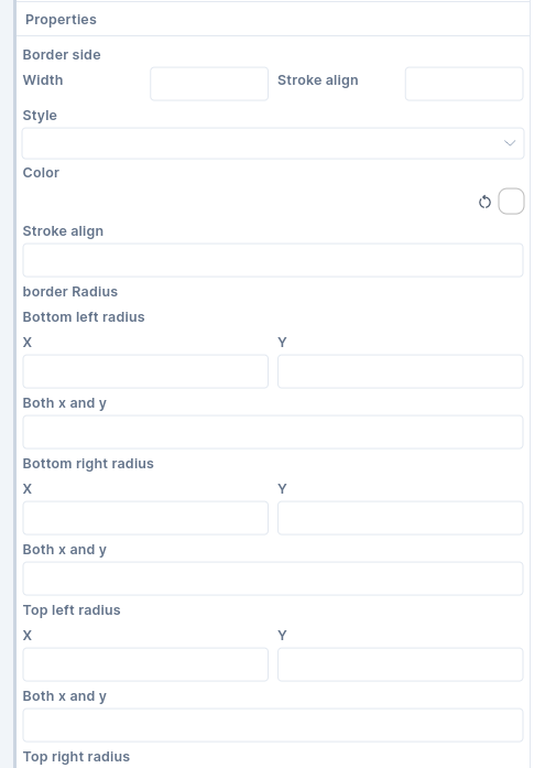
- For different kinds of borders set various border properties. These borders include
Border,Enabled Border,Disabled Border,Focused Border,Focused Error Border, andError Border.
Following are the border properties that can be set.
- Set the
Widthof the border with theStroke Alignvalue. StrokeAlign value ranges from -1.0 to 1.0. A value of -1.0 indicates a border inside the edge while 1.0 indicates an outside border. A value of 0 sets the center of the border on the edge of the widget. - You may choose to make the border width
solidor apply anonevalue. - You can make corners of the border rounded. Set
Bottom Left,Bottom Right,Top Left, andTop Rightradius values.Xvalues indicate horizontal axis values whileYvalues indicate vertical axis values. Just play around with the values to check how it works.