Scaffold
Scaffold provides a basic layout structure for the screens. It is the foundation of every screen. When you add a new screen, Scaffold widgets gets automatically added. It occupies the entire space on the screen. It has multiple places where you can place widgets. It may consist of an App Bar, Drawer, Body, Bottom Navigation Bar, Floating Action Button, etc.
-
The
bodyis the primary content of the Scaffold where you normally put most widgets. It is not a list to accommodate multiple widgets. Instead, you must put a single widget like Column, which itself then accepts multiple widgets. -
The
appBaris a horizontal bar placed at the top of many apps. -
The
Draweris where you often see the three little lines on the top left corner of an app. When you click it, it then shows a menu that appears over the app. Thus Drawer swipes from left to right. -
Some apps have the
Floating action buttone.g. a plus button at the bottom center or bottom right of the screen. It always floats on top of everything. -
The
Bottom Navigation Baris like a menu at the bottom of the screen with destination widgets. We can add Text, and multiple icons in the bar. -
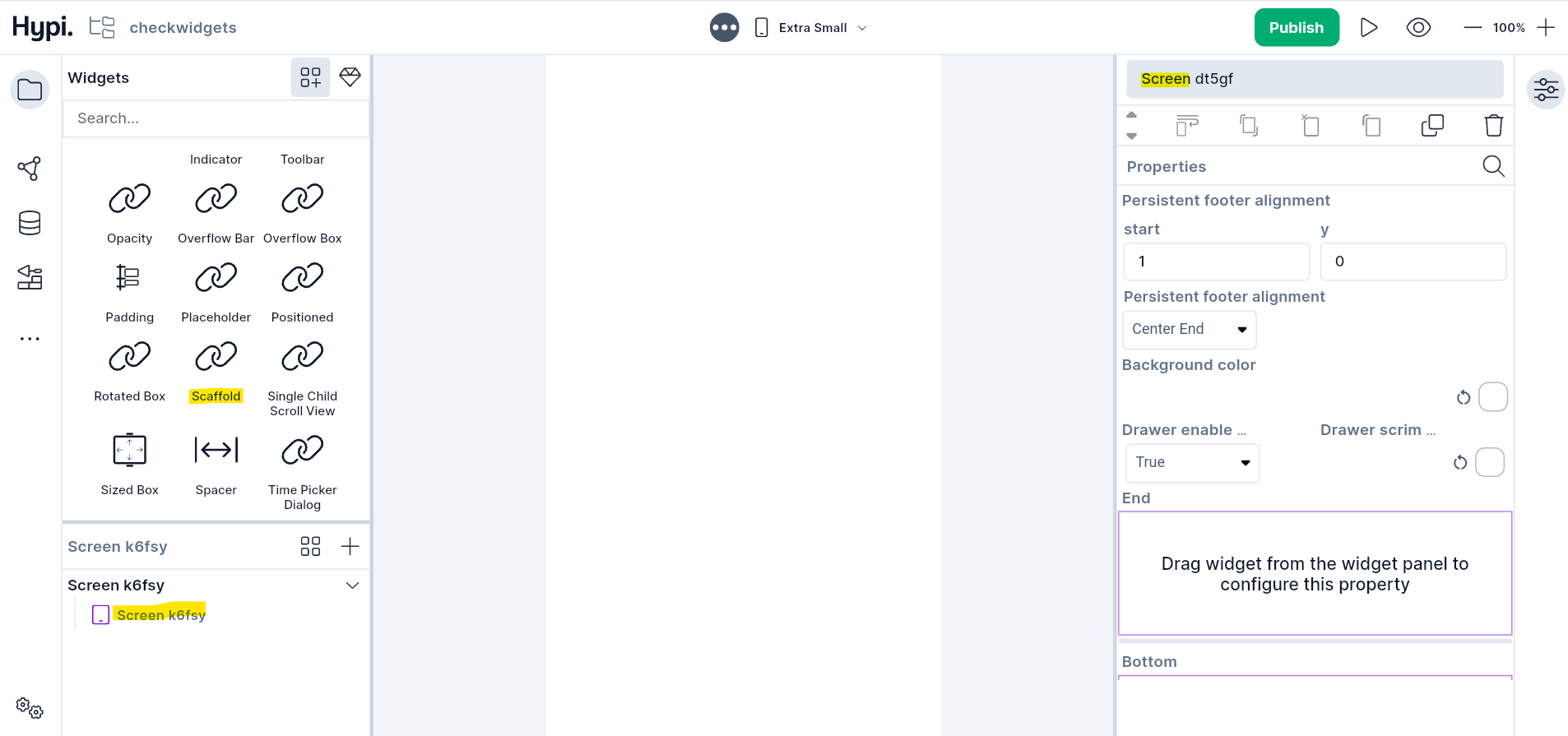
The
Persistent Footer Buttonsare displayed at the bottom of the scaffold. They are placed just above the Bottom Navigation Bar but below the body.
Properties
- The
persistent footer alignmentproperty aligns the persistent footer buttons.startparameter is the distance in the horizontal direction and theyparameter is the distance in the vertical direction. The Alignment Position can be Bottom Center, Bottom Start, Bottom End, Center, Center Start, Center End, Top Center, Top Start, Top End, etc. Drawer enable open drag gesturedetermines if the drawer can be opened with a drag gesture on mobile. On desktops, the drawers are not draggable. By default, the value is true.Drawer Scrim coloris the color to use for the scrim that obscures primary content while a drawer is open.- Drag the Widgets from the widgets panel to the
Endsection orDrawersection to create the Drawer menu. - Select the
Backgroundcolor andDrawer color. - Drag the App Bar widget to the
Appsection to create App Bar. - Set
Restoration IDto save and restore the state of the Scaffold. - Check
Drag Start Behaviourhere. - Drag the Bottom Navigation Bar widget or any other widget to the
Bottomsection to create Bottom Navigation Bar. - Drag any Layout widget that accepts multiple widgets to the
Bodysection. - Drag the Action Chip button to the
Floatingsection to create a Floating action button. - Select the
Floating Action Button Locationfrom the drop-down. - Drag the Action Chip button to the
Persistentsection to create a Persistent Footer button. - Set
Extend Bodyto true or false. If it is true and the Persistent Footer button or Bottom Navigation Bar is displayed, then the body extends to the bottom of the scaffold. Otherwise, it extends only to the top of the Persistent Footer button or Bottom Navigation Bar. - Set
Primaryto true if the scaffold is being displayed at the top of the screen.