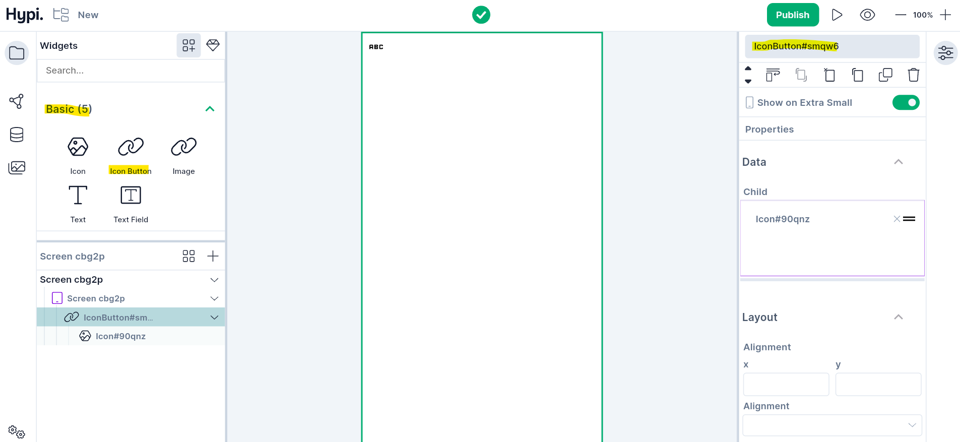
Icon Button Widget
Overview
The Icon button is a widget with an icon placed on its front. Choose from hundreds of images from Hypi's Tink's icon collection to place on the icon button widget. It is an interactive button and triggers the OnPressed event when the button is clicked.
Use Cases
- When picture representation is needed on the button, the icon button can be used.
- Icon Buttons are generally used in the AppBar actions field.
Properties
For various states of the button, color properties can be set as follows.
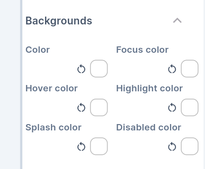
- Set the default Button color using the
Colorproperty. - When the Button has the keyboard Focus, the button will get the
Focus color. - Hovering the mouse over the Button changes the color of the Button to
Hover color. - Pressing down the button gets highlighted with a
Highlight color. Splash coloris the color of the ripple effect that shows up around the border of the button when the button is pressed.- Disabled button gets
Disabled state color.
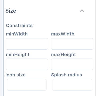
- Set the Icon Size and Splash Radius from Size Properties. It sets the icon size and radius of the button around the icon.
- You can also set the minimum and maximum Width and Height of the button.
- The Alignment places the widget at a certain position inside the parent widget boundaries. The Position can be Bottom Center, Bottom Left, Bottom Right, Center, Center Left, Center Right, Top Left, Top Right, Top Center, etc. Choose the Icon position inside the button appropriately.
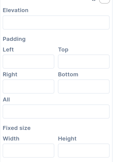
- Padding can be provided to the Button on all sides or top, left, bottom, and right edges. The value has to be provided in terms of physical pixels.
- If the Autofocus is set to true, the Button will get initial focus. If there are many widgets on the screen, the Button will have focus by default. If a user presses Enter, then the Button will get pressed. If the Button doesn't have Autofocus, then any other widget will get the initial focus.
- The elevation gives raised appearance to the Button. The value has to be given in Pixels.
- Set the Size of the Button by providing width and height in terms of pixels.
- To enable acoustic and/or haptic feedback, set Enable Feedback to true. For example, a clicking sound and a long press with short vibrations can be enabled.