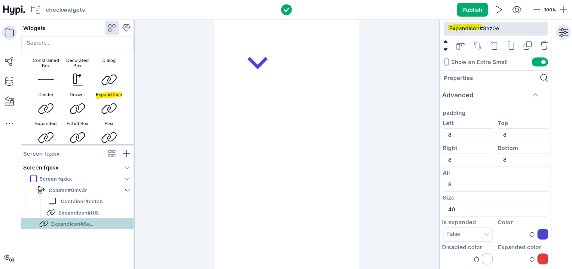
Expand Icon
Overview
An Expand Icon widget represents a rotating expand/collapse button. With an OnPressed event, the icon rotates 180 degrees. It reverts the animation on a second event. Expand Icon uses the underlying icon : Icons.expand_more.
Use Cases
For a dropdown menu, the expand icon state changes between expanded and collapsed with an OnPressed event.
Properties
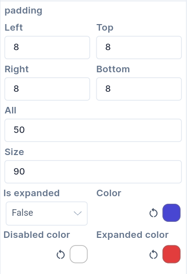
- Provide
Paddingvalues to create space between the expand icon and the parent widget. Padding can be provided on all sides or top, left, bottom, and right edges. - Set the
Sizeof the Icon in pixels. - Set
Is Expandedto true to trigger the icon in an expanded state. Making it false will collapse the Icon. - Set the default Icon color using the
Colorproperty. - When the icon is in an expanded state, it will get the
Expanded color. - Disabled icon gets
Disabled color.