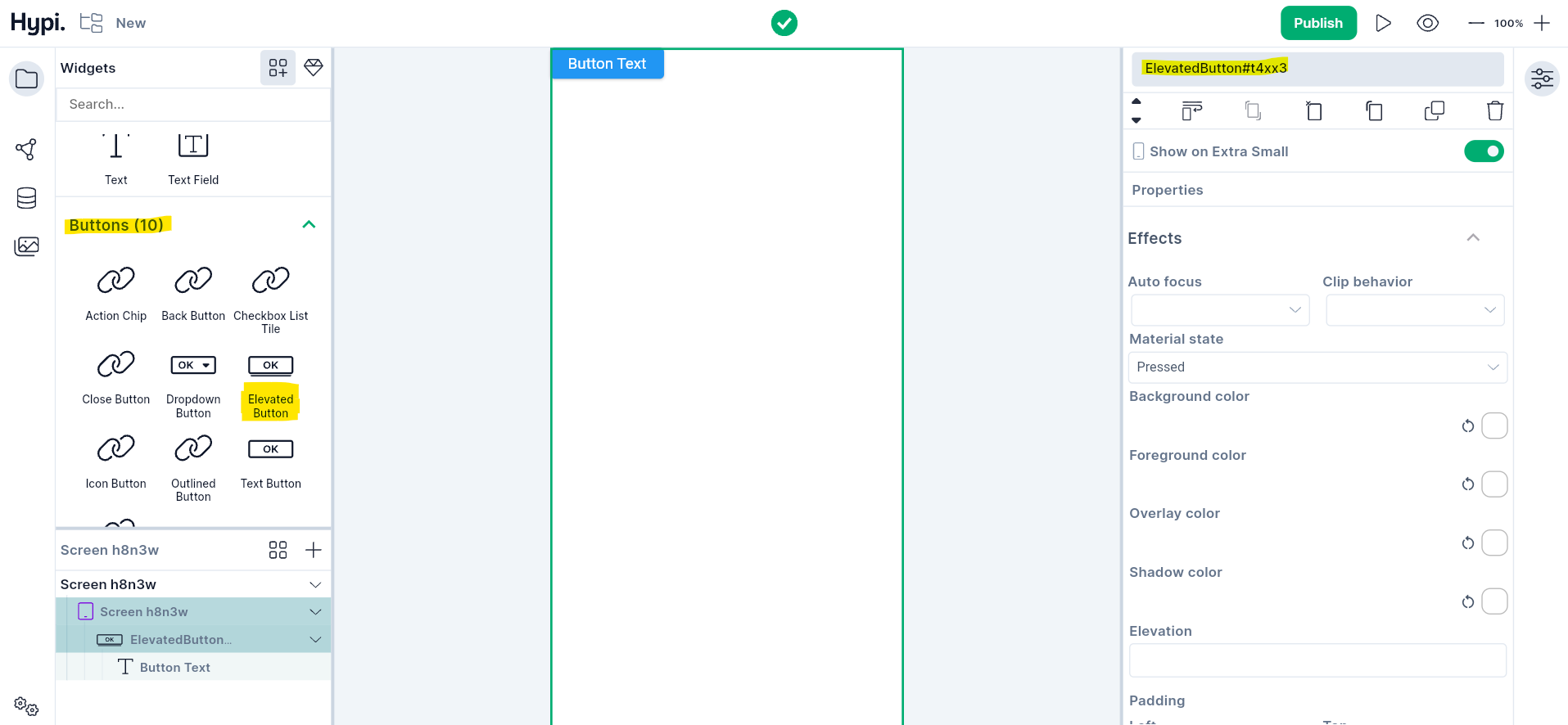
Elevated Button Widget
Overview
An Elevated Button provides raised appearance to the Button. It has an Elevated Button as a parent widget with one child Text widget to provide the label to the Button. Change the properties of both these widgets by selecting them from the left-hand side navigation panel.
Use Cases
- Elevated button is used when other elements on the screen are generally flat.
- The elevated style of the button captures the user's attention.
- For different states of the Button, the button style can be customized.
- For overflow of the Text, the clipping property is available.
Properties
- Button text properties can be customized with the Text widget properties.
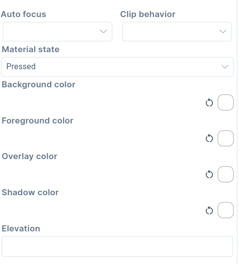
- There are five states of the Button for which appearance can be customized. The states are default state, mouse hovering, focus state, pressed state, and disabled state. The appearance of the button can be customized using the following colors.
- Background color sets the background of the button.
- Foreground color sets the child widget color on the button.
- When the mouse gets hovered over the Button, it gets an overlay color.
- Shadow of the button gets shadow color.
-
The elevation gives raised appearance to the Button. The value has to be given in Pixels.
-
If the Autofocus is set to true, the Button will get initial focus. If there are many widgets on the screen, the Button will have focus by default. If a user presses Enter, then the Button will get pressed. If the Button doesn't have Autofocus, then any other widget will get the initial focus.
-
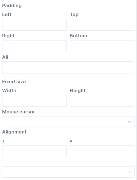
If the content overflows the widget boundary, then there are following ways to clip it.
- Anti Alias - It clips the edges to have a smoother look.
- Anti Alias with Save Layer - It clips with anti-aliasing and saves the Layer immediately following the clip. This process is slower than Anti Aliasing and is rarely used.
- Hard Edge - This is the fastest clipping with low fidelity. No anti-aliasing, or smoothening of edges applied.
-
Change the Size of the Button by providing width and height. The values can be provided in terms of pixels.
-
Provide Padding values to create space between the child widget and the outer border of the Button.
-
The Alignment** places the widget at a certain position inside the parent widget boundaries. The Position can be Bottom Center, Bottom Left, Bottom Right, Center, Center Left, Center Right, Top Left, Top Right, Top Center, etc. Choose the child widget position inside the button appropriately.