Dialog
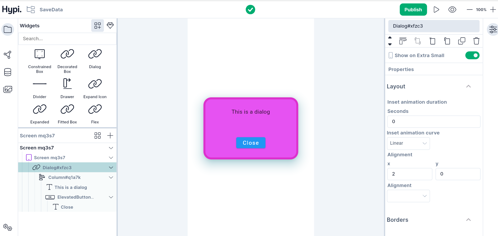
Overview
The Dialog widget creates a dialog with a single child widget. Usually, there is no specific purpose for this dialog. It can convey any kind of information or ask a user to take any action.
Any layout like a Column or Row can be a child widget of the Dialog.
Properties
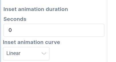
- Inset animation only has an effect on phones like iPhones that have the round curve area at the bottom for the button. If the dialog overlaps with the iPhone button then there is an animation that redraws the bottom of the dialog so that it goes around the curve.
- Set the values of Inset Animation Duration in Seconds.
- Set the values of Inset Animation Curves
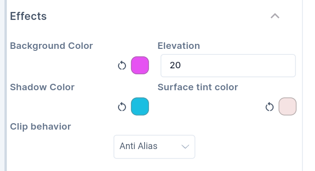
Backgroundcolor sets the background of the Dialog.- Shadow of the dialog gets a
Shadowcolor. - When the elevation is greater than zero, then the action chip surface gets a tint to look like it is lifting off the rest of the screen. This tint color gets applied on top of the normal color. You can choose your own Surface Tint color.
- The
elevationgives raised appearance to the Dialog. The value has to be given in Pixels. - If the content overflows the widget boundary, then there are the following ways to
clipit.
- Anti Alias - It clips the edges to have a smoother look.
- Anti Alias with Save Layer - It clips with anti-aliasing and saves the Layer immediately following the clip. This process is slower than Anti Aliasing and is rarely used.
- Hard Edge - This is the fastest clipping with low fidelity. No anti-aliasing, or smoothening of edges applied.
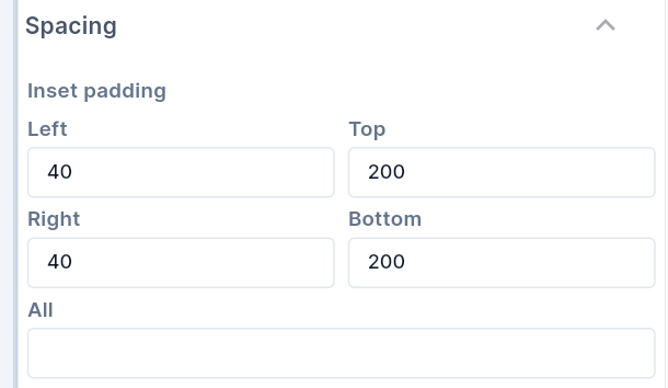
-
Provide
Inset Paddingvalues to create space between the screen's edge and the outer border of the Dialog. Padding can be provided on all sides or top, left, bottom, and right edges.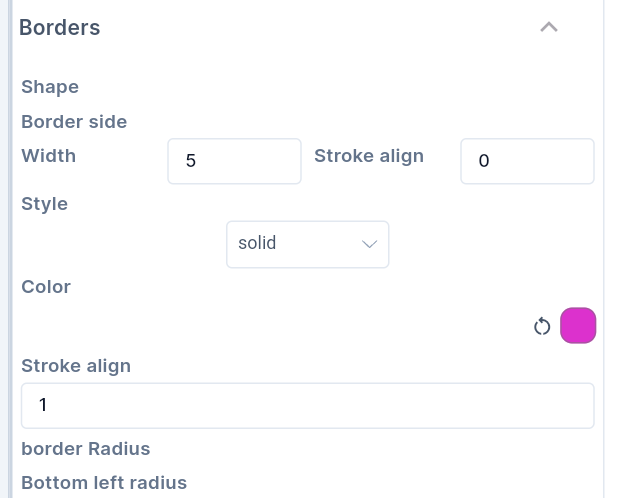
Following are the border properties that can be set.
-
Set the
Widthof the border with theStroke Alignvalue. StrokeAlign value ranges from -1.0 to 1.0. A value of -1.0 indicates a border inside the edge while 1.0 indicates an outside border. A value of 0 sets the center of the border on the edge of the widget. -
Set the
Colorof the border. -
You may choose to make the border width
solidor apply anonevalue. -
You can make corners of the border rounded. Set
Bottom Left,Bottom Right,Top Left, andTop Rightradius values.Xvalues indicate horizontal axis values whileYvalues indicate vertical axis values. Just play around with the values to check how it works. -
The Alignment** places the widget at a certain position inside the parent widget boundaries. The Position can be Bottom Center, Bottom Left, Bottom Right, Center, Center Left, Center Right, Top Left, Top Right, Top Center, etc. Choose the child widget position inside the dialog appropriately. X and Y coordinates can also be provided to position the child widget.