Card Widget
Overview
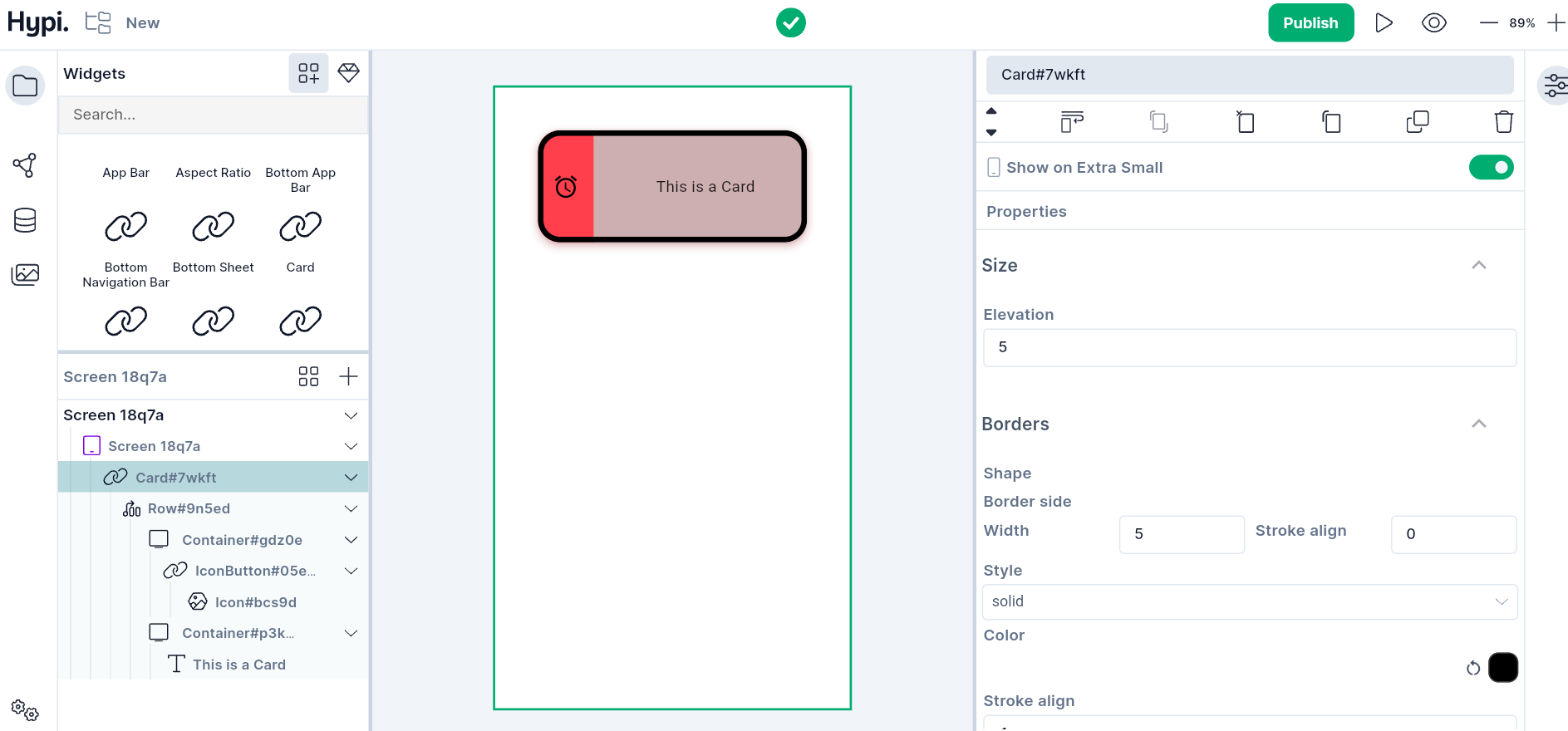
A Card is a layout panel with slightly rounded corners and an elevation shadow. It is used to represent some related information, for example, an album, a geographical location, a meal, contact details, etc. You can design a Card by placing required child widgets into it. E.g. A Row with Text and Icon widgets.
Use Cases
- Important information can be displayed on the Card and the User may or may not take action on it.
- Card's elevation, border, and background color can be adjusted to provide the desired appearance.
Properties
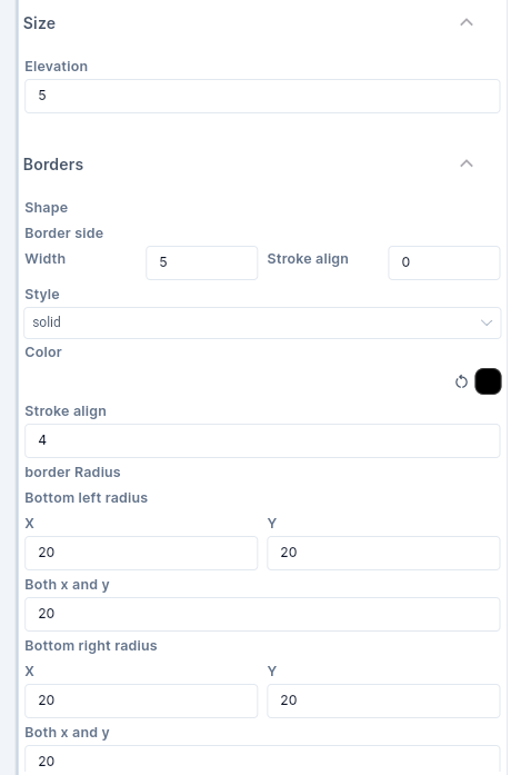
- Elevation gives raised appearance to the widget. Provide Elevation for the Card in Pixels.
Following are the border properties that can be set.
- Set the
Widthof the border with theStroke Alignvalue. StrokeAlign value ranges from -1.0 to 1.0. A value of -1.0 indicates a border inside the edge while 1.0 indicates an outside border. A value of 0 sets the center of the border on the edge of the widget. - You may choose to make the border width
solidor apply anonevalue. - You can make corners of the border rounded. Set
Bottom Left,Bottom Right,Top Left, andTop Rightradius values.Xvalues indicate horizontal axis values whileYvalues indicate vertical axis values. Just play around with the values to check how it works.
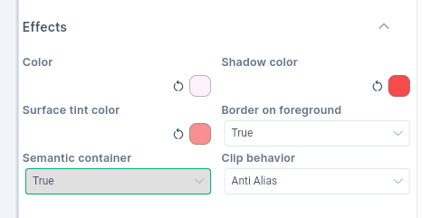
- Color sets the background of the Card.
- Shadow of the Card gets shadow color.
- When the elevation is greater than zero, then the Card surface gets a tint to look like it is lifting off the rest of the screen. This tint color gets applied on top of the normal color. You can choose your own Surface Tint color.
- Set
Border on Foregroundto true, if you need to show a border around the Card. - If the content overflows the widget boundary, then there are following ways to clip it.
- Anti Alias - It clips the edges to have a smoother look.
- Anti Alias with Save Layer - It clips with anti-aliasing and saves the Layer immediately following the clip. This process is slower than Anti Aliasing and is rarely used.
- Hard Edge - This is the fastest clipping with low fidelity. No anti-aliasing, or smoothening of edges applied.
-
If this widget represents a single semantic container, set
Semantic Containerto true. Iffalse, it is a collection of individual semantic nodes. -
Provide
Marginvalues to create empty space around the Card. Margin can be provided on all sides or top, left, bottom, and right edges.