Action Chip Widget
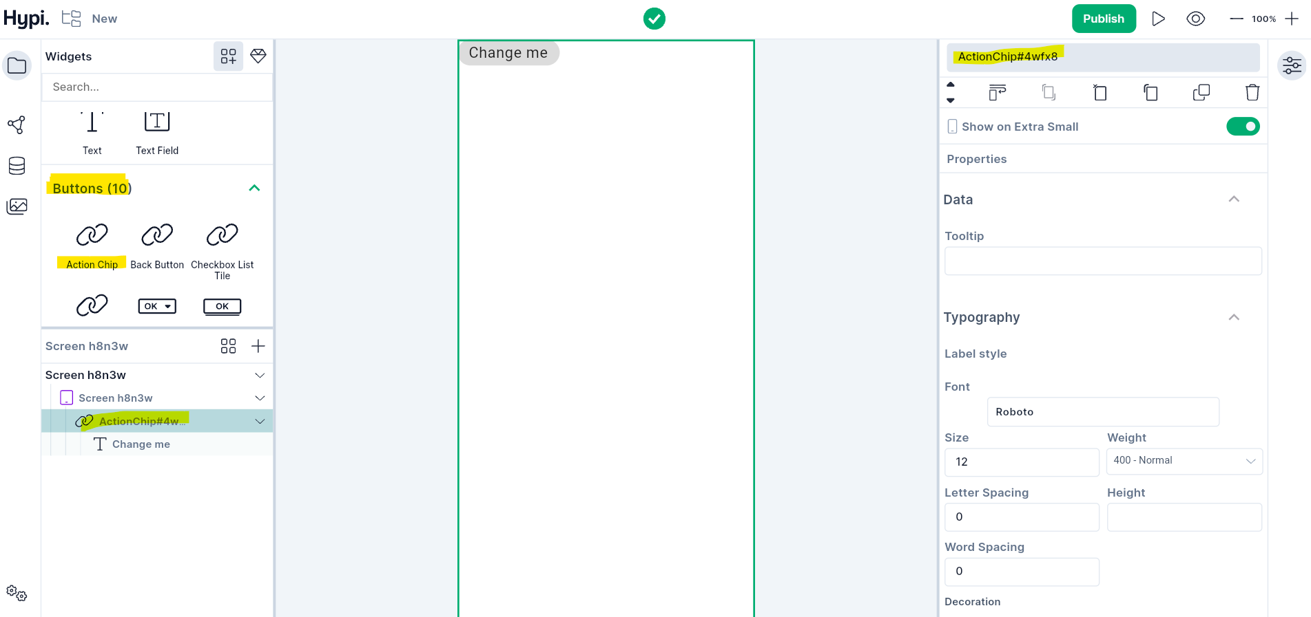
Action chip triggers an action related to primary content or shows progress and confirmation. It holds an Avatar and Text. Showing Avatar on the front is optional. Drag the Avtaar widget from the widgets panel to the right hand side Properties panel. You may also replace the Text child widget with any other widget or remove the Text widget.
Use Cases
- Display after primary content (below a card or at the bottom of the screen)
- Change the Text of the child widgets from the Properties panel.
- Handle OnPressed event from the Logic section to implement an action.
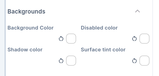
Properties
- Background color sets the background of the action chip.
- Disabled color sets the disabled appearance of the action chip.
- Shadow of the chip gets shadow color.
- When the elevation is greater than zero, then the action chip surface gets a tint to look like it is lifting off the rest of the screen. This tint color gets applied on top of the normal color. You can choose your own Surface Tint color.
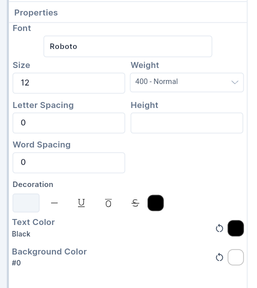
- Set the Font of the text by choosing an option from the menu. The menu appears after clicking on Font from the Typography section. Fonts available in Google Fonts Library are enlisted in the Font Menu.
- Set the Font size by providing values in pixels.
- Change the Thickness of the Text using Weight option.
- Change the Letter spacing to create space between two letters. Change the Word Spacing to create space between two words.
- Set the Height of the Text Widget by providing values in pixels.
- Set the Text Color and Background color of the Text.
- Decorate the text with the
Underline,Overline, orStrikethroughline. The line'scolorcan be changed. TheThicknessof the line can be changed by providing values in the edit box. Setting the style toNonereverts the changes.
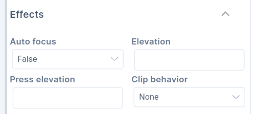
-
The elevation gives raised appearance to the Button. The value has to be given in Pixels.
-
Elevation for the pressed state can also be given in Pixels.
-
If the Autofocus is set to true, the Button will get initial focus. If there are many widgets on the screen, the Button will have focus by default. If a user presses Enter, then the Button will get pressed. If the Button doesn't have Autofocus, then any other widget will get the initial focus.
-
If the content overflows the widget boundary, then there are the following ways to clip it.
- Anti Alias - It clips the edges to have a smoother look.
- Anti Alias with Save Layer - It clips with anti-aliasing and saves the Layer immediately following the clip. This process is slower than Anti Aliasing and is rarely used.
- Hard Edge - This is the fastest clipping with low fidelity. No anti-aliasing, or smoothening of edges applied.
- Provide Padding values to create space between the child widget and the outer border of the Button. You can also provide Label padding values to provide padding around the label.